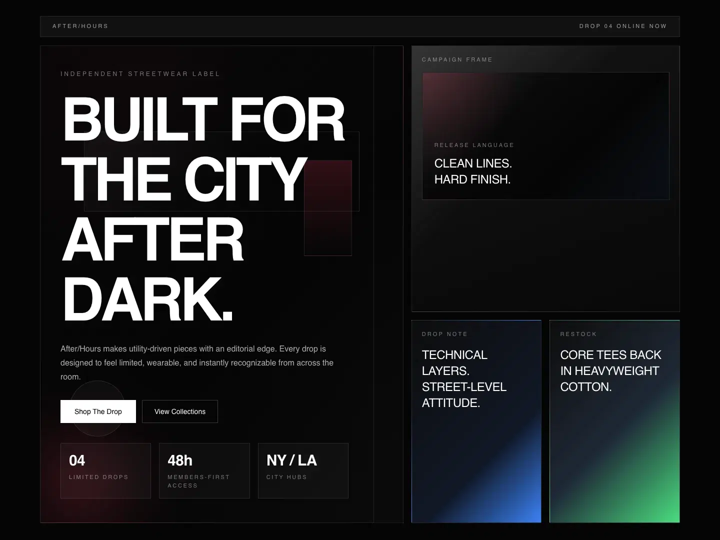
A strong opening
The campaign hero introduces the drop through scale, contrast, and a direct collection action.
Self-initiated concept · AI-assisted exploration
Release energy, expressive art direction, and direct collection journeys.
← All work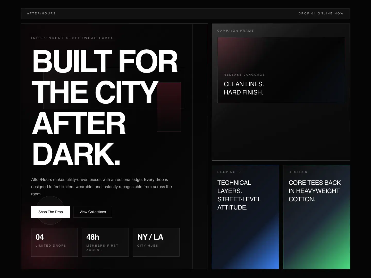
The concept brief asks how an independent label could give a collection a strong point of view while keeping browsing paths direct.
Bold contrasts and large type create release energy. Collection hierarchy is intended to help visitors move from the campaign to individual pieces.
The intended journey moves from a clear first impression to useful detail, then an obvious next action.
High-contrast surfaces, assertive sans serif type, collection cards, and a product grid form a distinct merchandising system.
The system is intended to reflow into a readable single column on small screens. Content hierarchy, image proportions, and clear action labels carry the direction across sizes.
Visual direction / material study
Hierarchy · Contrast · Rhythm
After dark
Campaign white
Release accent
Inside the concept
The campaign hero introduces the drop through scale, contrast, and a direct collection action.
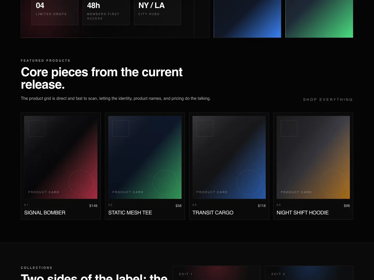
Cards and product details support a consistent browsing rhythm rather than a series of unrelated promotions.
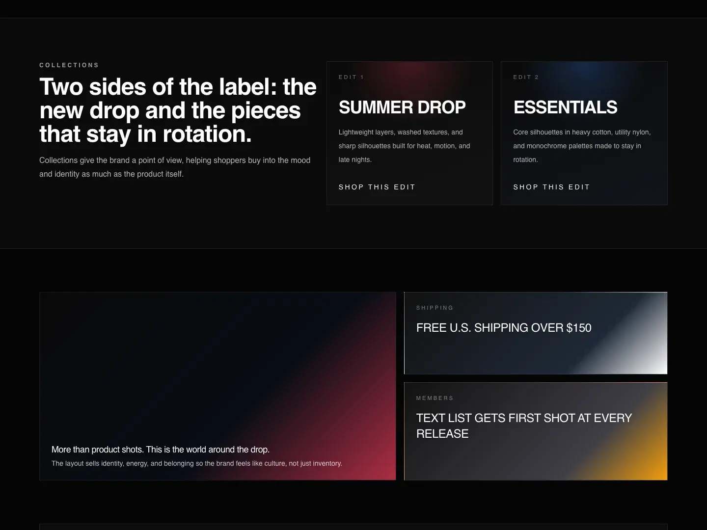
The product grid reduces columns and preserves clear labels and touch targets. Checkout and fulfillment would require separately evaluated custom scope.
This concept demonstrates a connected approach to page hierarchy, visual direction, and responsive implementation.
A real engagement would need verified content, audience research, usability checks, and validation of the business’s operating requirements. Demo names, events, products, and project details are illustrative.
Have a project in mind?